
specialised system icons

specialised system icons
In order to design icons and graphic user interfaces in general, one must have the user in mind.
For my semester project of m.e.t.i.s. I designed graphic user interfaces for the interaction devices of the communication sub-systems. In order to do so I derived guidelines to answer to the user, senior dementia sufferers, as well as the necessary alterations for the specific device - large touchscreens
The general design for seniors must be specified, especially because of poor eye-sight and diseases like dementia. Large touch screens can be mistakenly perceived as TV screens (Šimić, 2018) or even as black holes within the wall (Feddersen & Lüdke, 2014, p. 106). Therefore, indicators to touch the screen to engage interaction are needed. Furthermore, the colouring itself is important. Using a permanent dark background for the graphic user interface supports clear readability at night, while providing good legability during the day as well. Since the Circadian rhythm is highly important to the physical health of the elderly, especially for dementia sufferers, utilizing blue light in the morning is reccommended. In the evening, a filter must be used to ensure a well-rested sleep.
Zhao X. J., Plocher T. and Kiff L. (2007), Tao D., Yuan J., Liu S. and Qu X. (2018), and Šimić (2018) agree that the icon size for seniors must be significantly enlarged in order to fit their needs. Zhao X. J., Plocher T., and Kiff L. (2007) report the correlation between the speed of use and size, therefore the usual sizes for the elderly is between 110mm and 130mm. At high speed, a button size of up to 190mm is needed in order to ensure precision. Tao D., Yuan J., Liu S., and Qu X. (2018) remark further, that shadowed icons are faster identified as buttons. Hence, icons of touchscreens, which resemble known objects and their common use, are more easily accepted.
Finally, Šimić (2018) adds concerning large touchscreens, that its physical usability needs to be considered. The position of the touchscreen needs to be mounted to the wall, fitting to the unique user.
Feddersen E. & Lüdke I. (Eds.). (2014). Lost in Space: Architecture and Dementia. Berlin, Germany: Birkäuser Verlag GmbH.
Šimić M. (September 12, 2018). Designing for Large Touchscreens [Blog post]. Retrieved Febuary 5, 2019, from https://www.bornfight.com/blog/designing-for-large-touch screens/?fbclid=IwAR2TM_XeEx34DNB-ABtG7EMwnGvY-6PONzowfUlUGJkR M-egqSm3VVW6Nuk
Zhao X. J., Plocher T., & Kiff L. (2007). Touch Screen User Interfaces for Older Adults: Button Size and Spacing. Retrieved Febuary 5, 2019, from https://www.research gate.net/publication/225367546_Touch_Screen_User_Interfaces_for_Older_Adults_Button_Size_and_Spacing
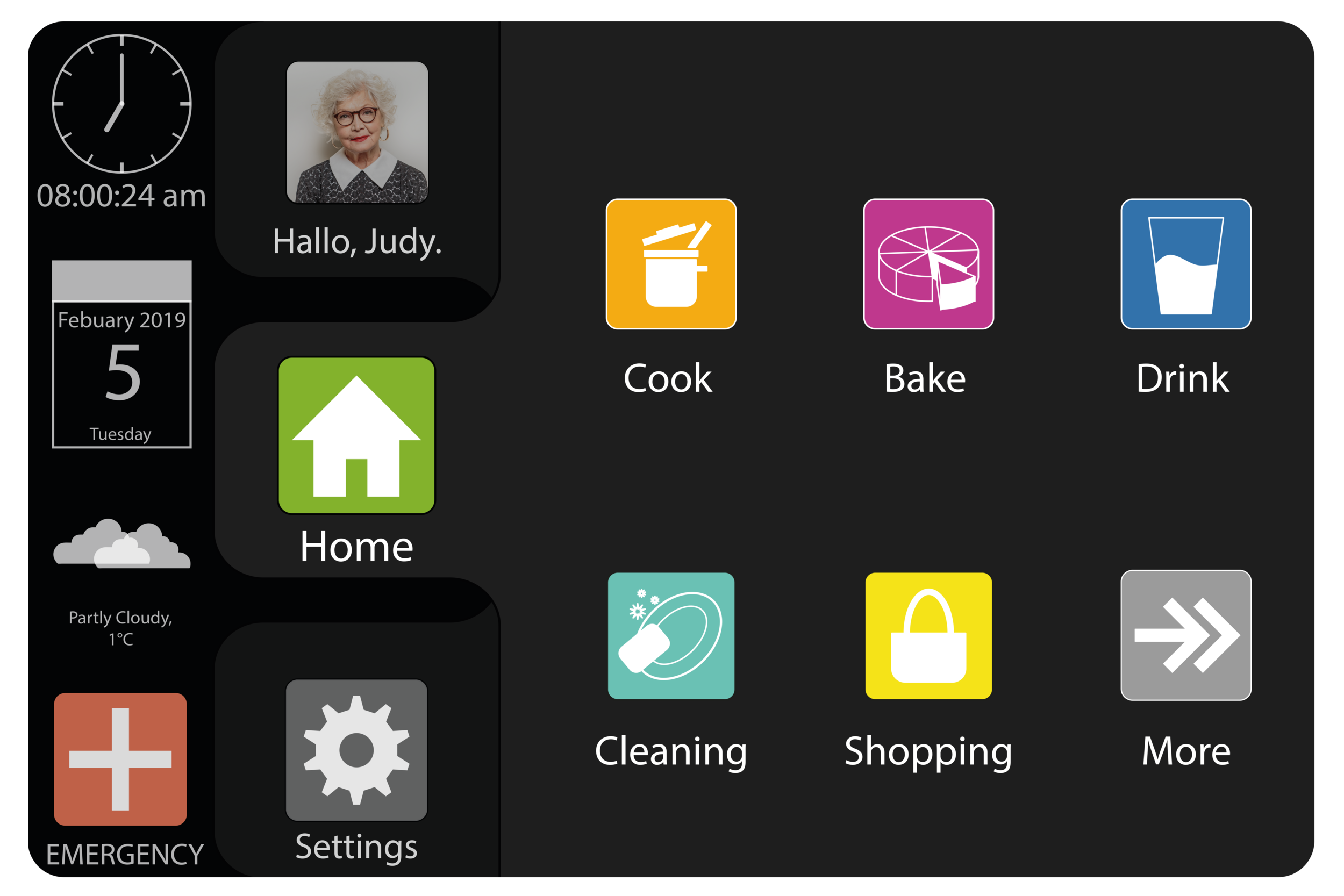
GUI/ kitchen
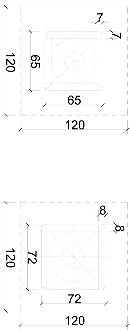
main Tab icon sizing/ unselected and selected
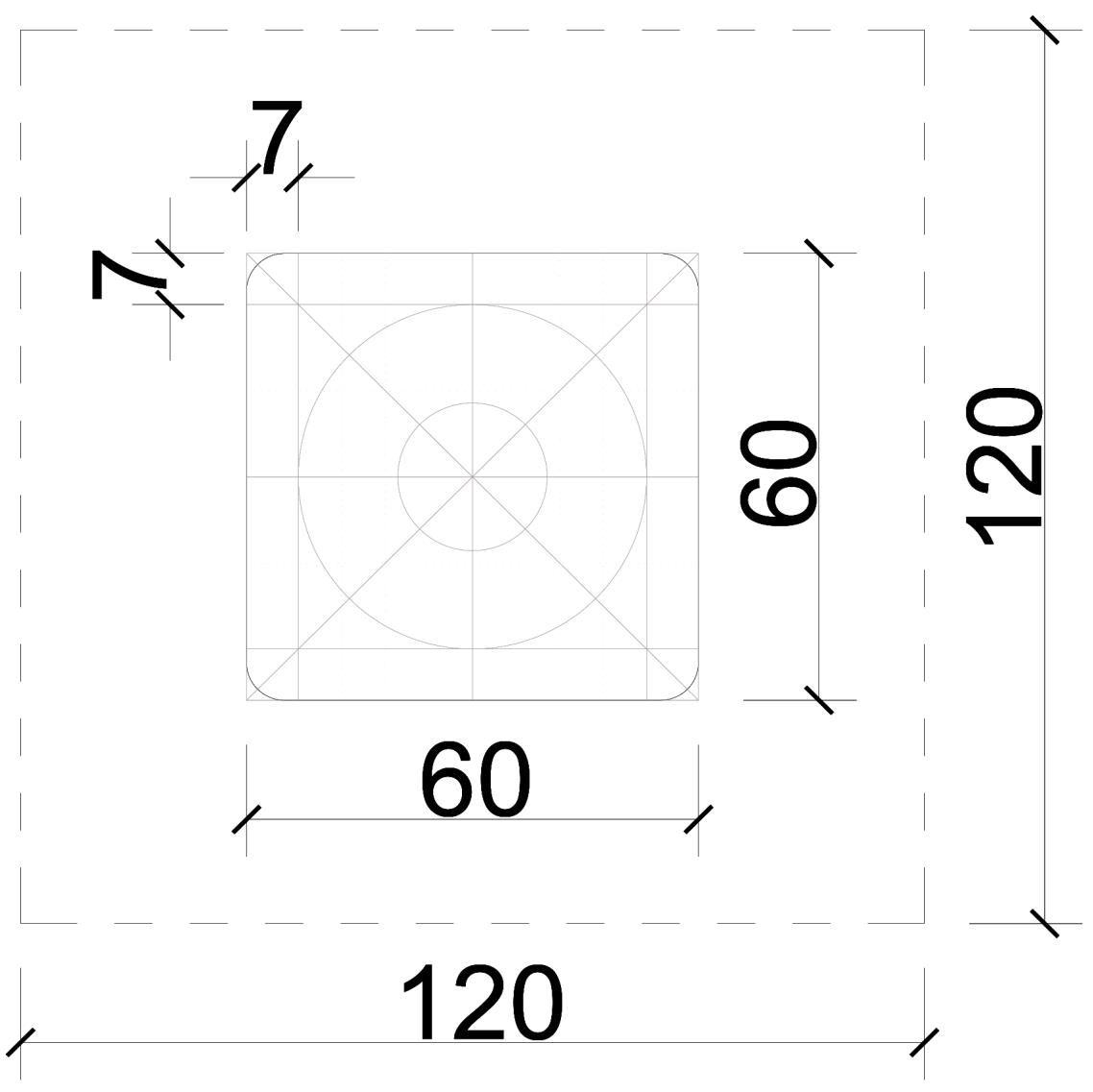
app icon sizing
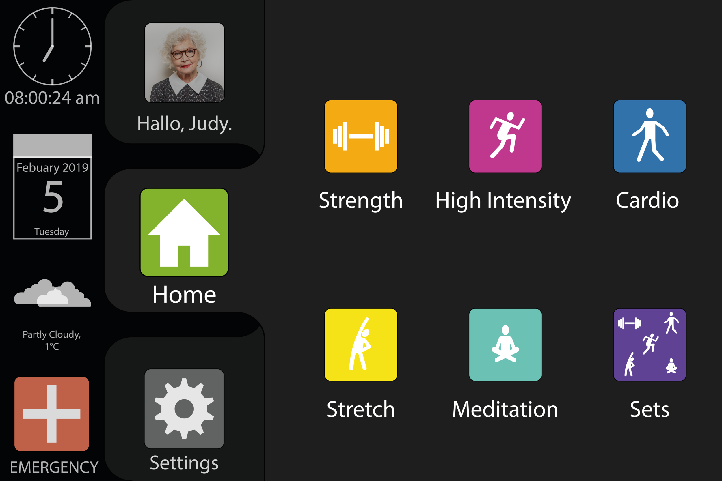
GUI/ activity station
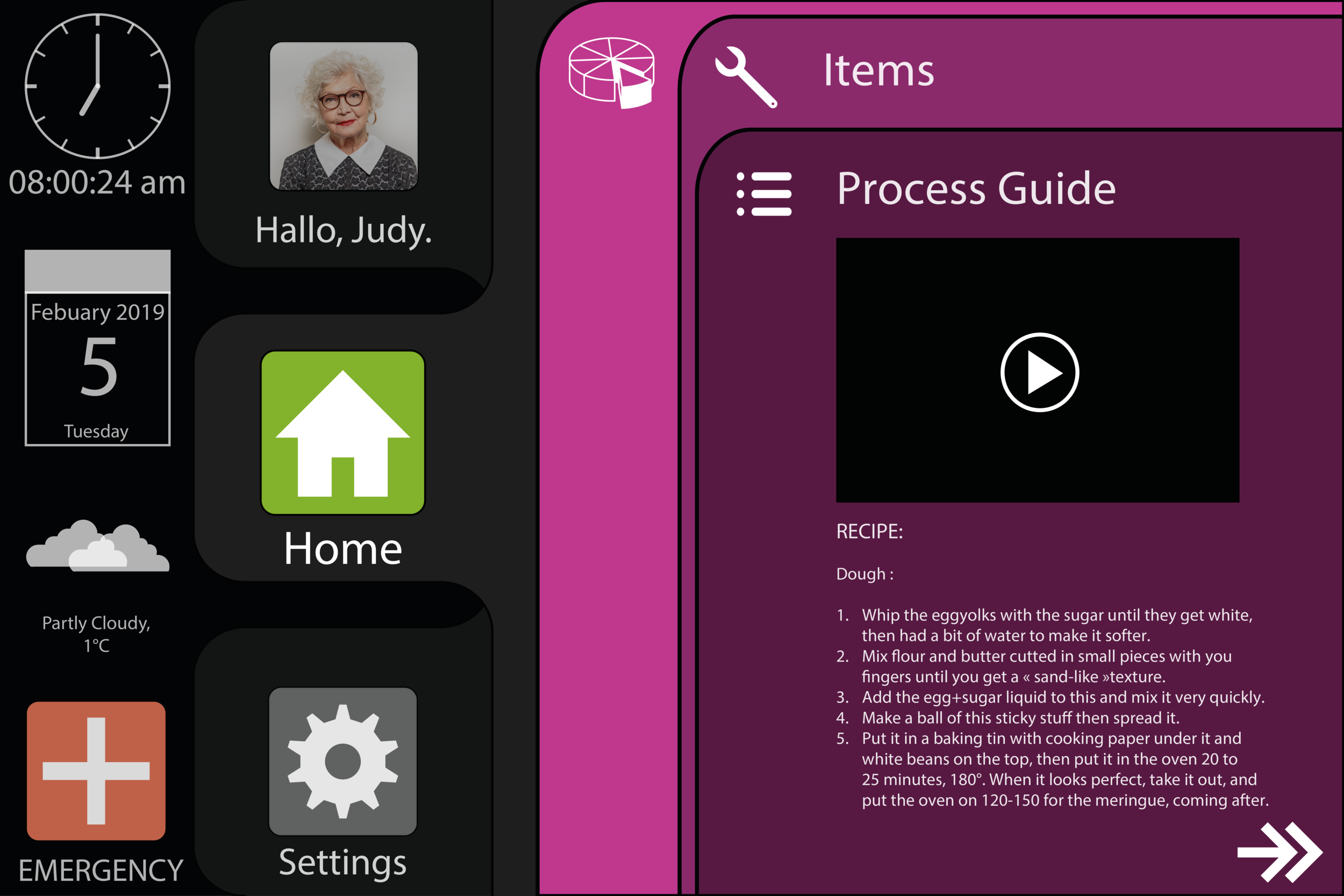
GUI/ kitchen with opened application as layered tabs
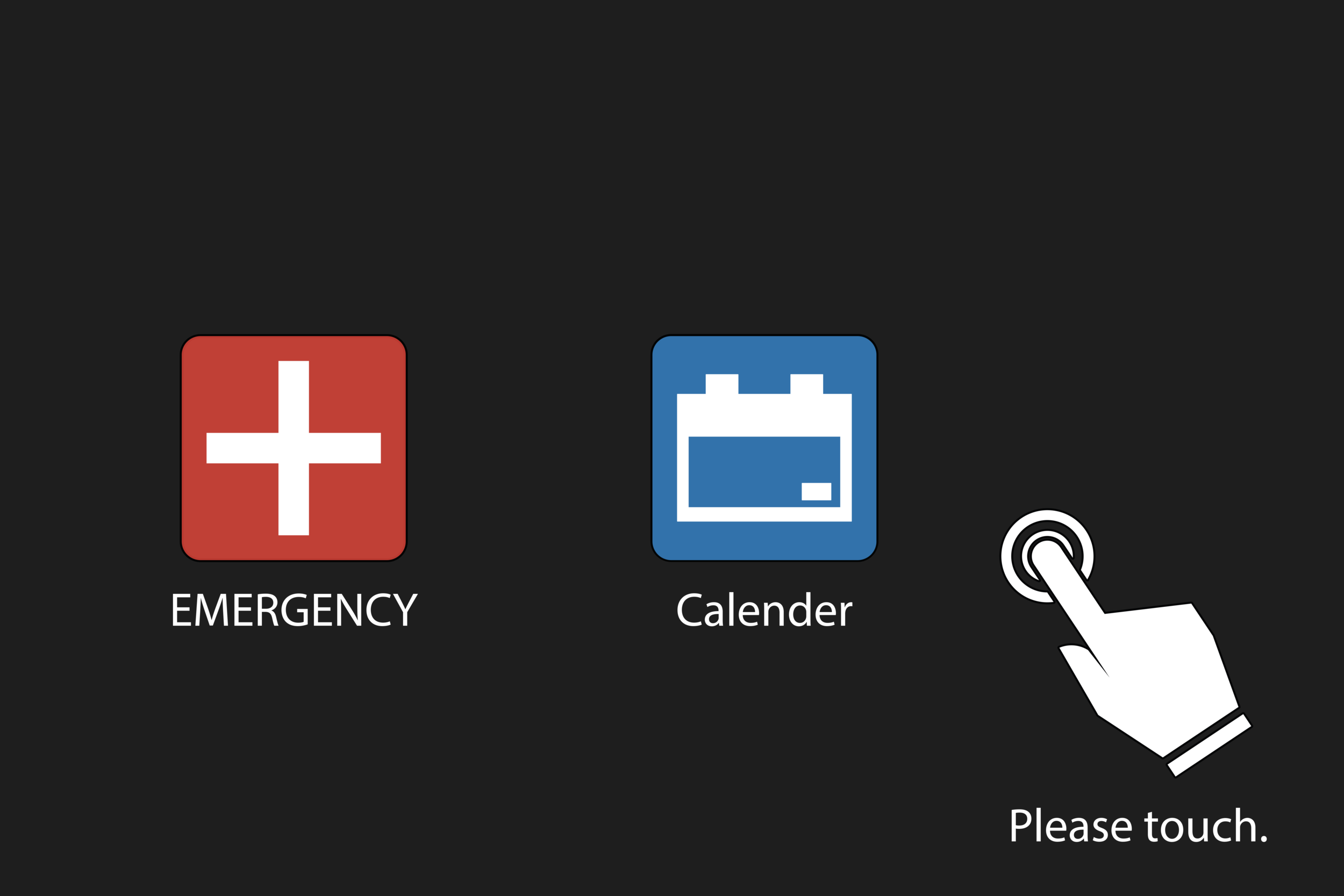
standby mode with touch indication

GUI/ bathroom
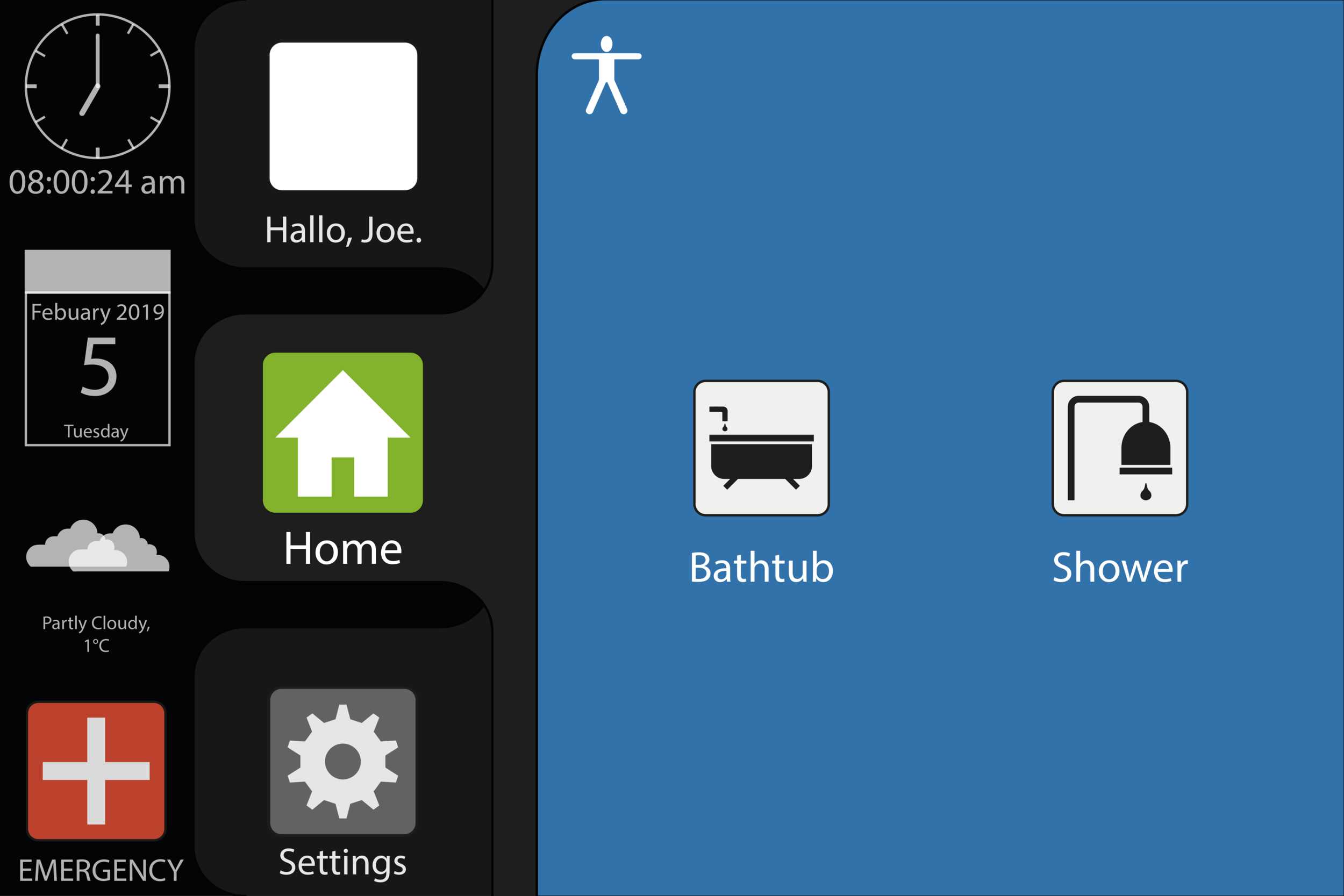
GUI/ bathroom with application opened
